Case Studies
KGPCo Exhibit and Experience Design
KGPCo is a leading provider of supply chain management solutions for the telecommunications industry. They needed a tradeshow booth design that would help them stand out in a crowded industry and showcase their innovative products and services. The company turned to a graphic design and experience design team to create a booth that would attract visitors and communicate their brand message effectively.
The design team began by creating a visually stunning booth that incorporated KGPCo's branding and messaging. They used a combination of bright colors, large graphics, and bold typography to draw visitors' attention and communicate the company's message. The team also designed an interactive experience that allowed visitors to engage with the company's products and services, creating a memorable experience that would stick with them long after the tradeshow ended.
Overall, the tradeshow booth design was a huge success, attracting a significant amount of foot traffic and generating a lot of buzz for KGPCo. The company was able to effectively communicate their brand message and showcase their products and services, helping them stand out in a crowded industry and generate new business opportunities.
Cereals & Grains Association
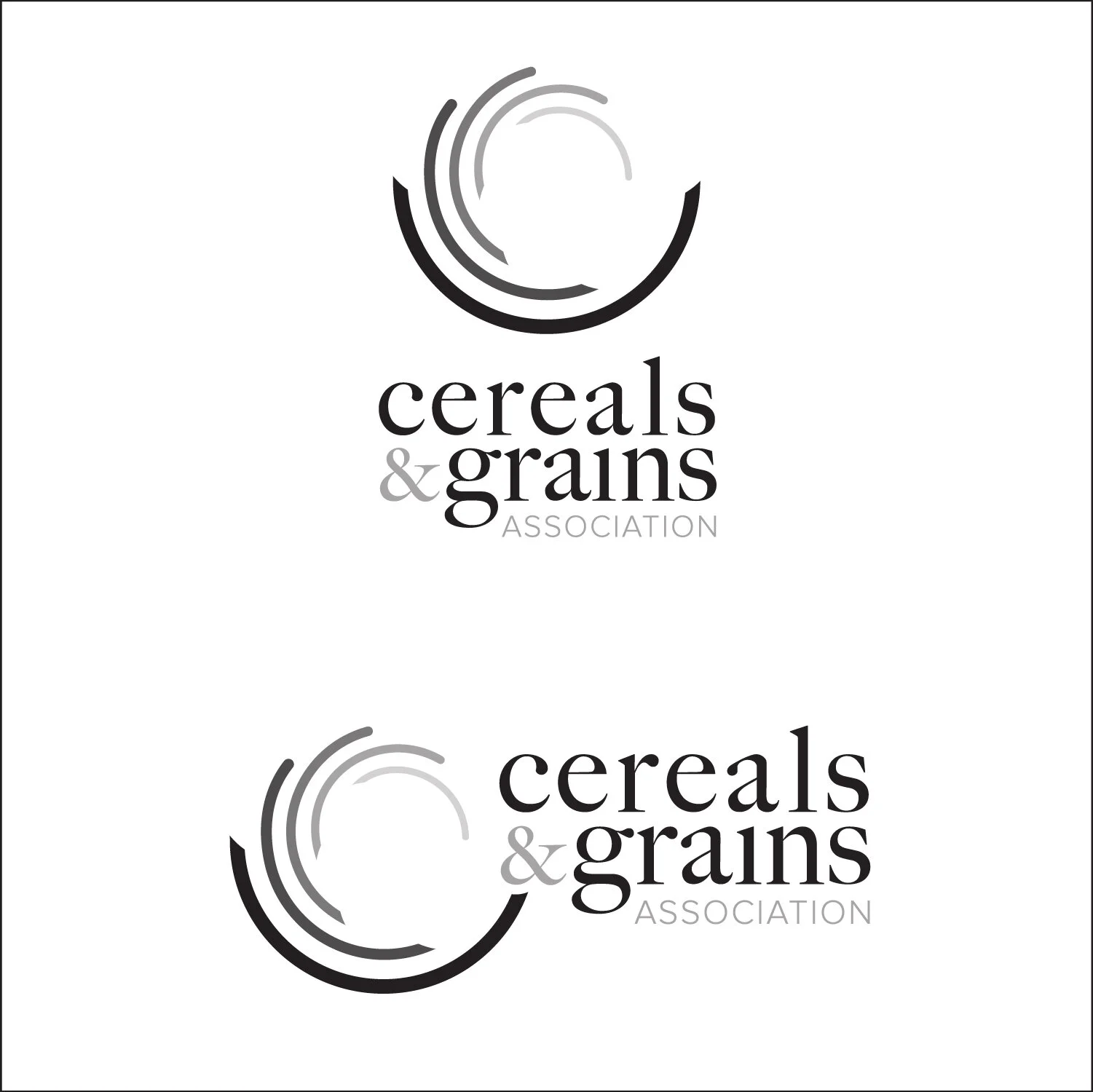
The Cereals & Grains logo was a complex project that was a collaborative effort between myself, our Art Director, and also an outside marketing agency. The complexity was mainly found in the idea of inclusion of all the various areas of study and variety of species within the cereals and grains profession. Beyond that, the previous mark had been in place for the last 75 years making this one of, if not the, biggest change in the organizations history.
Our core focus points were to created a modern and trustworthy logo that represented trustworthiness around the world. Within those boundaries, the specific imagery, or lack there of, was the biggest challenge. With such a diverse list of species and specialties, we looked to create imagery that was ambiguous enough to not represent a specific cereal while still implying both cereals and grains. This is mostly seen in the oblong dots or line endings which represents the cereals as they are defined as the usable parts of the grains are extracted (this excludes the stocks, roots, and etc).
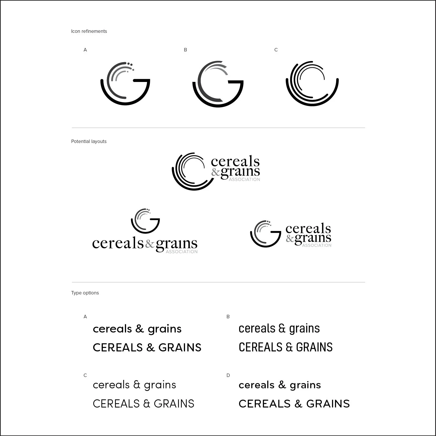
Like many design discoveries, the pieces starting coming together after about 3-4 weeks of ideation and conceptualizing. The circular shape represents the world, but also a base or vessel with the stocks spawning from within and ending with the cereals. This created a multi-meaning symbology of natural growth, worldliness, and also food supply when represented as a bowl with the food product (cereals) leading back into the bowl after growth.
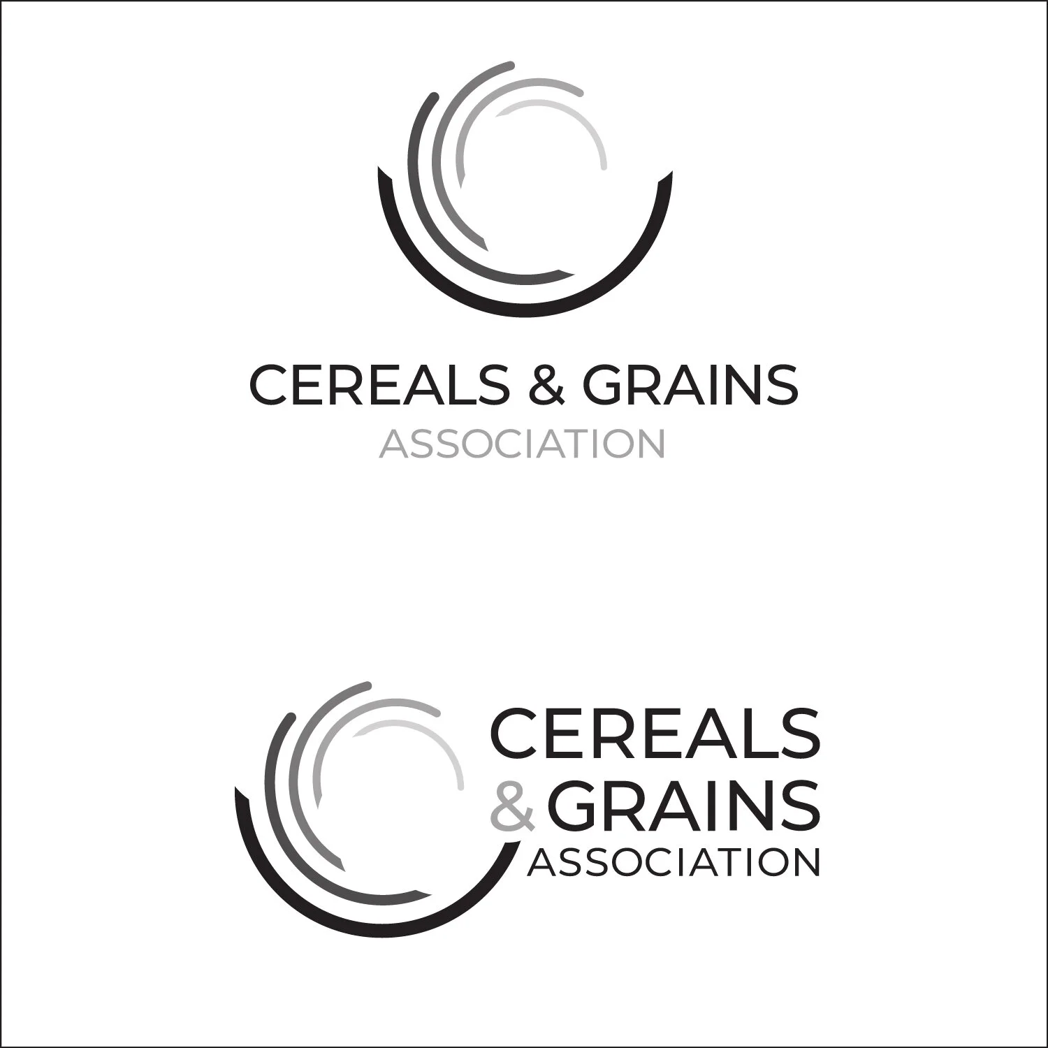
The typeface selection process followed under the same reasoning as the mark. We initially moved forward with a serif to imply the expertise and trust but did not seem to fit as being contemporary. Serifs were making a trending comeback but we decided a sans serif would create a more timeless representation for longevity. The “lockup” followed during experimentation with the vessel leading into the ampersand which created a solid connection between the mark and typography.
The color palette selection was our final step. We started with the psychology of colors as a base for our selection but we wanted to created a fresh, modern look. There is also a secondary representation which is water, earth, and sun, the essentials needed for the growth and development of plants.
In the end, this project was an exciting challenge as well as a great opportunity for collaboration from start to finish. Overall, the rebrand spanned roughly 9 weeks, typically meeting once or twice weekly. The mark was voted on and passed by the board in March of 2019 and fully implemented as of August, 2019.
Occult Brewing Co.
The Occult Brewing Co. project was one of the more fitting branding jobs that I have worked on. Occult is defined as “supernatural, mystical, or magical beliefs, practices, or phenomena.” Being that I had great interest in this subject before hand, I was extremely excited to jump on this project. In short, the word “Occult” can mean many things to many different people from satanism, to magic, and the supernatural. For this client, I was instructed to go right down the middle of that with something edgy but not extreme. In my mind, it was to create something “artistic” that would also not shy away any kind of customer.
After a few days of researching imagery, definitions, and history I began to conceptualize a variety of iterations. Some of the reoccurring themes that I found, as seen above, were shapes (pyramids and circles), snakes, the all seeing eye, old english type, and etc. Within the first few weeks of back and fourth with concepts, we began to nail down a more defined brand. This began with the type “occult” creating a crescent moon and a nearly symmetrical form.
With our final direction nailed down, we began to mix in color (a little taboo at this stage, I know), or lack there of. We quickly settled on a black a white palette, a rich CMYK. With the majority of collateral being specialty items like beer cans, menus, and tap handles, we focused a lot more in materials and textures like paint, felt, metal, and etc.
The final mark was completed with the addition of the pyramid with a floating hop with a glowing orb engulfing it. The mark and typography quickly converged into a unified mark. I would say that this brand mark was as close to a passion project as it could get, while still being a paid project.
ICPP 2018 Mobile App
The ICPP 2018 mobile app was designed and developed with equal thoughts in form and function. ICPP 2018 is part of an annual meeting series put on by The American Phytopathological Society (APS). APS is a non-profit organization focused on promoting education on plant health and plant disease around the world. The majority of the membership demographic is heavily based in technical science and how it applies in the real world to better plant health.
The mobile app was designed to function to aid way-finding, scheduling, planning, and problem solving with a focus in ease of use. The splash screens welcomes you with the ICPP branding which include the dates of the meeting. Within the app, there is a clean iconic home screen with easy one-click navigation to locate anything from the speakers for that day, the list of abstracts and poster presentations, way-finding, scheduling and more. The app was used as a sister piece to the physical printed program book (which has been used for the past 60+ years) that contained the same information but the app created a much faster and easy to use system. On top of that, it was built on a format to reuse the wireframe for the coming years so it is also more cost efficient than the printed program which typically ranges anywhere from 70-110 pages.
Overall, this project was an immense challenge to implement but created a more seamless, efficient interaction. We were initially worried about the success rate within the member demographic but had positive results on a post-meeting survey.


